Showing posts with label NARRATIVE. Show all posts
Showing posts with label NARRATIVE. Show all posts
12.02.2011
Project 5: 7 Deadly Sins PART II
I'm very happy to be able to work on this project again. Although it was the objective, last semester, I felt that a website wasn't the right platform for this particular piece. It wanted something more, but I just wasn't sure what it wanted to be. During my mid semester review with Tyler I had mentioned that I wanted to explore live action footage more because I haven't really done so yet. My memory is a bit fuzzy, but I believe in the conversation that Tyler mentioned that my 7 Deadly Sins project from last semester could definitely move, and EUREKA! An idea is born.
Originally, the project focused on body language, color, facial expressions and props to communicate the sin. All of these elements in the translation will remain the same, but now with the addition of sound and motion. Due to our timeframe, I choose to focus on only one sin, pride.
Briefly, I sought out to explore the idea of how can typography be captured and manipulated with live action film and so I developed these objectives for myself:
- Interact with typography through live action film
- Clearly express the word (sin) being manipulated
- Work with multiple channel interactions such as video, type and sound
The concept of my original representation of this sin was that pride is something that is in your face and wants to show off. So for my motion piece, the character comes in to the screen, notices the viewer, and immediately initiates a pose off. The video ends with the character throwing throwing its pride in your face.
So, what did I learn? (chuckle chuckle)
It may only be a 10 second video, but for me, I feel like this was a pivotal moment for me as a designer. Most of the time, I can usually calculate in my head if a project is doable, but this time it raised a lot of red flags, but my gut feeling told me to go for it. Anyways, during this project I had deal a lot with troubleshooting. I learned the importance of planning and preparation in regards to pre-production. Specifically, what items I'll need for production such as props and outfits for consistency and the importance of lighting. Another challenge I faced was learning new software. For this project I began to begin to explore Cinema 4D, because I've learned in the past that the best way to learn these types of skills is by making it a limitation. If cinema 4d is the only program I can use, then hell, I better learn it because my success/failure depends on it.
Lastly, I can't believe I pulled this off within this crazy timeframe!
Ok, I'm good now.
11.23.2011
Inspiration: All We Ever Wanted
When I saw this video for the first time, it immediately reminded me of my Gertrude Stein project from Type III. The unveiling and layering of small amounts of details to transform meaning and perception. However, I mostly wanted to share this video because I felt it was an interesting blend of both digital and analog production methodology such as how they transition from one scene to another.
11.21.2011
Narrative Project Goals
My final project will be an extension of my 8-bit seven deadly sins project, while exploring the idea of how typography can be captured and manipulated with live action film. This project will consist of the expression of one of the sins, such as wrath, while interacting with the main character.
View 7 Deadly Sins project here.
Objectives:
- Interact with typography through live action film
- Clearly express the word (sin) being manipulated
- Work with multiple channel interactions such as video, type and sound
11.19.2011
The History of Motion Graphics
Sometimes I get so absorbed into the here and now that it's almost strange to think about motion graphics in any way other than what it is today. I suppose this is where I mention the importance of where we came from in order to move forwards. Anyways, I believe the definition they provide, is an accurate yet loaded definition, "motion design is the art of bringing graphic design to life through animation." Its a complicated statement because what is graphic design really?
The video mentions that motions graphics began during the emergence of cinema. However, I believe the concept of motion is something that is innate in human beings, because we move and so does our world. So if our world is like a moving picture then one could argue that a static image is like a single frame from a larger motion piece. Maybe I'm going on a rant, but where motion graphics is now is just a more complex development of when the first caveman made a representational image on a cave wall. The next step of capturing our world would be photography, then the sequence of still images to create moving pictures. What I'm getting at is that with the advancement of technology and man, has a direct influence on complexity of motion graphics. Motion graphics now is the interaction of multiple means of representation.
The one area of motion graphics the video didn't really touch on was interactive design. Motion is no longer just a linear designer controlled narrative. People can now interact with moving graphics and vice versa.
11.17.2011
Logo Build: Final Deliverable
One of the most important concepts I've learned through this process was remembering to stop, refresh myself on the identity of the brand and ask myself whether I was aligned with the brand in my conceptual and formal decisions. I've realized that as the brand mark should stand alone in representing the attributes: modern, elegant, and timeless, it is the logo build that should enhance the perception of the mark and the brand itself through the narrative it tells. In the early stages of the assignment I had the issue of getting carried away in making something look formally "cool" rather than developing a solution that would enhance the brand. Working within a five second timeline forced me to identify the most essential elements to communicate the attributes of the brand and plan accordingly.
Finalized Timeline:
Finalized Timeline:
11.16.2011
Logo Build: Production Process
In my previous concepting step I focused more on the how the logo would form and not not the background or environment in which the logo would exist in. A large visual character of the brand are stars and outer space. Conceptually, the stars in the 816 Recording sense alludes to the idea of stardom as outer space refers to real estate that their clients can claim and shine for all to see thus the tag line "Your Piece of the Sky". It only seemed both appropriate and important to represent those elements in the logo build. I developing the visual direction of the environment, I wanted to somehow create a sense of depth in a subtle way so not to overpower the movement of the primary element. In researching different ways to approach this space-like environment I found an after effects tutorial site that had a similar look and feel to what I imagined.
Here's some of my process:
The visual effects of the sky was much simpler than it appears. It was created using layered fractal noise effects, like in the image below, with a curvilinear adjustment layer on top of all of them to create the spiraling effect you'll see in the video.
Resources:
Video Copilot After Effects tutorials
11.15.2011
Logo Build: 10 Framed Sketch
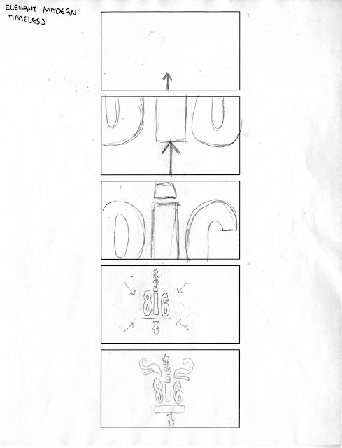
In the previous step we created a 5 frame storyboard, one frame for every second. This time we're refining our concepts using a 10 frame storyboard, which would equate to one frame for every half-second. Breaking down the logo build this way helps to visualize the movements and helps in timing the sequences. In my sketch below the build will begin with a close up of the needle, which will then rotate to reveal the constellations. Once the needle makes it around, the camera will slightly pan down to reveal more of the needle form as the wings swing up from the bottom of the screen causing the camera to follow it upwards. After the wings make it's full extension up it will flap back down and pan the camera down to reveal the 816 Recording type. Finally, the camera will zoom out to reveal the full logo and the tagline will fade in.
11.14.2011
Logo Build: 5 Concept Sketches
Modern, elegant and timeless. These are the elements that encompass 816 Recording. The brand mark alludes to a metronome (noise feed/record needle), but also a compass which points north to the stars above. In my directions below I focused on different ways to play with the directionality and symbolism of the brand mark with the concept of stars. which was a second element of the brand. However, after much consideration I went with the first approach below. The needle will spin to allude to both a compass and record player while simultaneously revealing a solar system. Immediately after the wings of the brandmark will swing upward then push down to reveal the remainder of the brandmark.
11.09.2011
Union Station: Interactive Timeline Final
For project two I was partnered with Jessie Ren to develop an interactive timeline for a hypothetical 100 year exhibition of Union Station. Every group was given a different decade to showcase specific content, Jessie and I had 80's. During the initial stages of the project we quickly learned that for most of the 80's Union Station was shut down, which was an immediate obstacle to resolve. After much consideration we took George Guastello's statement to heart that Union Station is the people's house, it is a reflection of the people and the times. The 80's were characterized for the technological revolution, the "Me, Me, Me, Generation", and binge buying. We felt that because American culture became high on the technological hype and mostly about the individual rather than community it only made sense for Union Station to be in such disarray. In our timeline we decided to represent both national events with local events to represent a correlation between the two.
10.10.2011
Union Station: Wireframe Directions
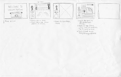
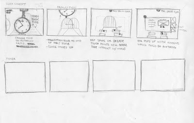
From our previous phase, Jessie and I made some major changes in the direction of our narrative. Originally, the interface was very much linear in regards to the nostalgic train riding process. During this revision process we struggled to maintain the train experience through the elements of the ticket, clocks and etc. while allowing for a more non-linear interface. We both wanted to keep the ticket as entry point to the experience, so we resolved this issue by allowing the timeline to sit on the back of the ticket. The next challenge we encountered was the issue of our so called "information graphic." We previously had horizontal train lines, which moved up and down without purpose. In order to further emphasize our story of how trains became insignificant in relationship to new developing technology, we divided the our train tracks into two categories: union station details and national details. The ups and downs allude to the idea of progression and digression in a loose manner.
Direction 01:
Direction 01:
Direction 02:
Union Station: Wireframe Concepting
In developing our concepts for Union Station, Jessie Ren and I sought out to recreate the journey and nostalgia of riding the train in our first approach. The user would begin the experience by receiving a ticket at the ticket booth, then prompted to choose a decade while in the waiting hall. Lastly the user will be taken to the platform where the content of the decade will reside. The user will use the train as a scroll bar for various content. In addition, the gentleman at the ticket booth would act as a tour guide to help clarify directions and to change decades.
 |
| Direction 01 |
 |
| Direction 02 |
Revision of Direction 01:
9.19.2011
Kinetic Typography: Gertrude Stein
Each line, each phrase of Gertrude Stein's poetry is like a single memory jumbled together with a lifetime of others. Some memories are faint while others are more vivid, but nonetheless they all leave a trace within us. The concept of the cross class project is the retelling of a heartbreaking moment in the life of one soul that was careless in love. I picked the two poems I felt showed the extreme transformation from naivety to maturity. In the translation from my printed artifact to the motion piece I wanted to focus on the layering aspect in regards to blending between multiple poems and evoking emotions.
Throughout this process I've encountered many obstacles, which I've learned much from. Firstly, I learned how to translate and execute the concept of simultaneity and layering in a motion piece. Understanding how to play out a concept in multiple situations forced me to also consider consistency within a motion piece, but also with the printed artifact. Lastly, I learned the hard way that files saved in After Effects CS5.5 will not open in older versions such as CS4.
8.22.2011
Silencio, por favor!
What do you do when everyone in the world loses their voice? You make a silent film, duh!
La Antenna, is a silent film made in 2007 by an Argentinian director and cinematographer Esteban Sapir using very lo-fi production methods. The most intriguing detail of the film were the subtitles. Can you believe that! They became more than just words on a moving image, they interact with the actors and the environment. I couldn't find a clip with a good example of the typography, but if you skip to 1:02 in the video you'll see one example. Also, there is some nudity in the clip if you wish to watch it in it's entirety.
If you're interested and have time, the whole film is on youtube and here's part one:
Subscribe to:
Posts (Atom)


