Showing posts with label VISUAL LANGUAGE. Show all posts
Showing posts with label VISUAL LANGUAGE. Show all posts
11.30.2011
Design Intervention: Buxton Reading
Buxton Reading Notes:
1. Prototypes are developed in the initial stages of a projects to explore and give a general impression of the concept.
2. They are quick basic sketches to help visualize an idea, but also open to allow for possible modifications.
3. The specificity of prototyping comes in the later stages, they address the immediate issue
4. Prototyping in a sense, is troubleshooting before investing large amounts of time and money to actually produce it.
Article Source: Prototypes by Buxton
Design Intervention: Final Presentation
The most important thing we learned from this project was trusting our gut feelings and taking a risk with the direction of the project. Understanding that it's okay to not know what will happen, but having the confidence to put it out there. That's where feedback plays an important role because based on the outcome of the testing we would know where to improve. The project is so dependent on the receiver and other variables to determine the outcome. A part of our struggle in both explaining and understanding our intervention was context. It was after we placed our components in the environment that everything came together and made sense. Knowing the context of the project and looking at it in context sooner would have helped us make more specific decisions.
The first area we wish could expand on would be developing the resource center more thoroughly. We only touched on the appointment card, but developing the resources in more depth such as forms, message boards and etc. Secondly, we wish we could expand on the way finding system. For instance, creating differences in the arrows and making it specific to the services or need may help to clarify the overall system. Lastly, we would like to explore a different mark or see how it would differ if we moved forwards with the icon symbol rather than an abstract mark.
11.26.2011
Design Intervention: Components
Here are the three components we felt were necessary to communicate our project:
1. Map - A flexible map that is specific to your location and shows where the resource is
2. Direction Arrows - Stickers that will help guide you along your journey
3. Door Piece - A sign that will greet and indicate that you've made it
1. Map - A flexible map that is specific to your location and shows where the resource is
2. Direction Arrows - Stickers that will help guide you along your journey
3. Door Piece - A sign that will greet and indicate that you've made it
11.09.2011
Design Intervention: Concept Refinement & Sketches
During this phase of the project we chose one direction to move forwards in refining and developing prototypes for. Ivan and I decided to move forwards with the guerrilla way-finding direction, which focuses on being able to locate resources. We realized that helping institutions don't advertise their services in areas that are accessible to the people that need it most, so we are creating a way finding system that guides people in the spaces they interact with the most.
Refined Proposal:

Prototype Sketches:
 |
| Large bridge sign |
 |
| Door greeting sign at the end of the journey |
 |
| Batman-like projection |
 |
| List of what type of help is offered |
 |
| Maps placed near crosswalks |
 |
| Arrows to guide people |
 |
| Icons to represent the type of help |
Design Intervention: Concept Proposals
Our final project this semester is design intervention. We are now applying what we learned about communication from our communication models to a real life situation, specifically, the systematic issue of poverty. How can we as designers address a breakdown in communication and propose a solution that will help to make a difference.
However, in order to understand the situation in which we are designing for and to identify a communication breakdown we must research. One way to gather information and experience is through walking in the shoes of the individual through a simulation. So, during class we all attended a poverty simulation sponsored by AIGA and USCAA. During the simulation I played Anne Aber, a mother of three children and wife to a recently unemployed Adam Aber. Taking what we experienced from the poverty simulation our first order of business was to come up with 3 different design interventions.
Proposal 1:
Our first direction focuses on students seeking that are involved in higher education or seeking higher education. During the simulation we saw an example of a student that struggled in providing for his family and how difficult it was to invest both the time and money to locate resources. So we propose a series of educational guides to help students seeking or involved in high education means to decode application processes and to help locate resources.
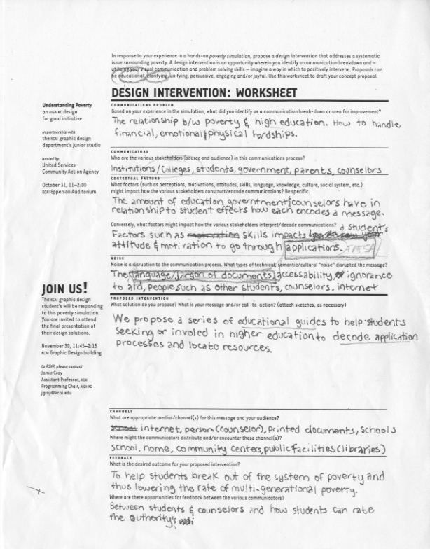
Proposal 2:
In our second proposal we realized that a lack of communication and organization within the family could be detrimental for their survival and progression. In order to keep the family on the same page we propose a home organization system to manage and prioritize responsibilities within the family. It will allow for good time management across multiple individuals allowing for more things to be taken cared of and act as a centralized hub for family members to communicate/check-in during their busy schedule.

Proposal 3:
During the simulation both of had been adults and so we identified how difficult it was to locate resources and how overwhelming the day to day stress was. Once the first day was over it we didn't have time to rest, we had to figure out a plan of action for the next day. So, for our intervention we propose an environmental or guerrilla graphic series that will alleviate emotional stress spontaneously throughout the day, but also provide information to resources.


Final Alonso & Mak Communication Model
Advances in technology has greatly impacted the way in which the people of this day and age communicate. In developing our communication model, Ivan and I felt that digital means of communicating in regards to the mass to mass and mass to person relationships were lacking in older models. In order to further explain the complexity of communication and provide in depth examples, we chose to create a key of graphic elements pulled from the actual model to speak more specifically to each topic of communication as well as to provide a quick and slow read.


10.31.2011


10.24.2011
Mode of Appeal: Final Artifact
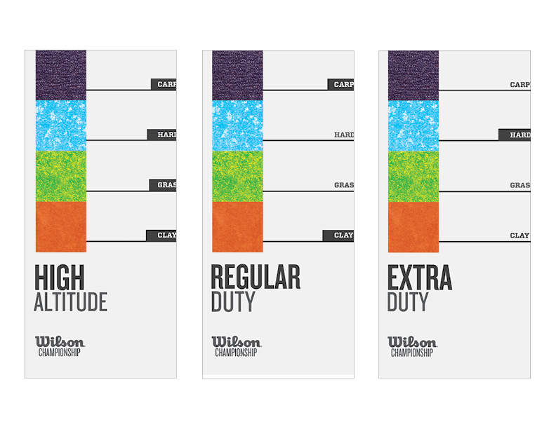
For my project I focused on creating a visual system for Wilson brand tennis balls. I took an informative approach to the different types of tennis balls in order to make it more accessible to novice players, but also a quick read for advanced players. In regards to executing this concept on a three dimensional object, I first created an abstract color coding system to represent each type of court surface. The overall form of the wrap alludes to a tennis court, but also the bouncing of a ball to guide the eye right. Hierarchically, I made the ball type larger to clearly distinguish the products along with the abstract courts. Directly below, in the white box, I placed a quick read about the best court type for that particular ball for immediate details. However, I used a line element to connect that detail with more detailed and friendly content in the back for novice players. I created icons and diagrams to allow for multiple levels of readability.


10.10.2011
Modes of Appeal: 5 Iterations
It's finally time to move into the digital world. For my five iterations I tried to represent the surfaces in multiple ways: abstraction, photograph, icon, color, and typography.
001:

 002:
002:

 003:
003:


004:


005:


001:


004:


005:


Modes of Appeal: 3 Concept Directions
From the previous step, we moved forwards with 3 directions that we felt had both formal and conceptual possibilities. Below are briefs on my chosen directions...
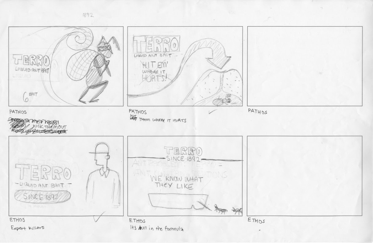
Product: TERRO Liquid Ant Bait
Mode: Logos to Pathos
Concept: Get them before they get you
In developing the TERRO Liquid Ant Baits I decided to move the mode of appeal from logos to pathos so I focused on creating a sense of fear or animosity towards ant invasions through ant patterning. While the direction clearly communicates, in general, it is a very expected approach.


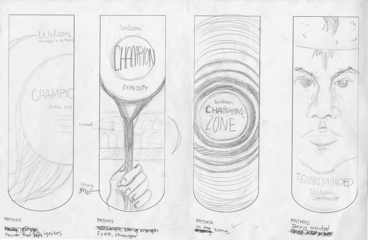
Product: Wilson Extra Duty Tennis Balls
Mode: Ethos to Logos
Concept: Know your duty
The one aspect of products with multiple options that I enjoy is when they clearly indicate or represent that information on the whole series. The ability to compare products within a brand helps consumers make a confident and educated decision. The issue I had with the sketches below is that it failed to clearly communicate the various types of courts and the best ball for them.


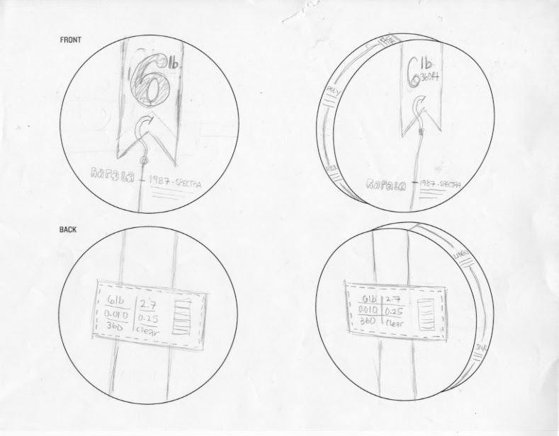
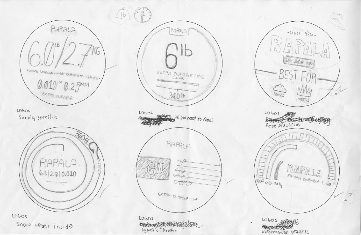
Product: Rapala Fishing Line
Mode: Pathos to Logos
Concept: The history of the fishing line
This product focuses on the representation of the history of the fishing line. The main issue I had during critique was whether that information enhanced the product any. It was suggested that I show the history of the company instead and change the mode to ethos.


Product: TERRO Liquid Ant Bait
Mode: Logos to Pathos
Concept: Get them before they get you
In developing the TERRO Liquid Ant Baits I decided to move the mode of appeal from logos to pathos so I focused on creating a sense of fear or animosity towards ant invasions through ant patterning. While the direction clearly communicates, in general, it is a very expected approach.


Product: Wilson Extra Duty Tennis Balls
Mode: Ethos to Logos
Concept: Know your duty
The one aspect of products with multiple options that I enjoy is when they clearly indicate or represent that information on the whole series. The ability to compare products within a brand helps consumers make a confident and educated decision. The issue I had with the sketches below is that it failed to clearly communicate the various types of courts and the best ball for them.


Product: Rapala Fishing Line
Mode: Pathos to Logos
Concept: The history of the fishing line
This product focuses on the representation of the history of the fishing line. The main issue I had during critique was whether that information enhanced the product any. It was suggested that I show the history of the company instead and change the mode to ethos.


Modes of Appeal: 50 Thumbnails
After careful consideration and developing a thorough understanding of our chosen products in regards to modes of appeal, it's time, once again to concept. For this phase we developed 50 concepts, approximately 8-10 per object to exhaust as many approaches to the modes of appeal as we could.
Wilson Extra Duty Tennis Balls:


Rapala Fishing Line:


Terro Liquid Ant Bait:


Wilson Extra Duty Tennis Balls:


Rapala Fishing Line:


Terro Liquid Ant Bait:


Subscribe to:
Comments (Atom)