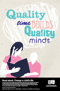
Taking a new direction with these posters was a good idea. Marty suggested that I dropped the headline of "Fuel for the Future" and start thinking warm and fuzzy. In order to make my poster typographically dominant I made the parent and child figure smaller in comparison to the type so that the imagery is more of a supporting factor to the type. For my headline I decided to change it to "Quality Time Builds Quality Minds" to emphasize the idea of how reading with your child not only allows the parent and child to spend time together, but it is also beneficial to the child's intelligence. I hand wrote all of the type to create a more childlike and quirky feel using various writing utensils such as crayons, markers, and pencils for their particular quality before I vectorized them. Overall I'm pleased with this new direction because I think there is more potential and more personal.


No comments:
Post a Comment