I learned my lesson from the book project and I was determined not to get behind or half ass (excuse my language) any of the beginning steps. Not taking the time to diligently work and think about the beginning stages of an assignment really effected my final product. So this time I wanted to make sure that everything I produce was equally strong. I had two days to complete this assignment so I divided it in half, I worked on three on Wednesday and three on Thursday. There was one major rule I kept in mind while working on these posters, if you get stuck for too long, move on and come back later.
Westport:
When I move to Kansas City, Westport was one of the first areas I had a chance to explore. Every time I was in the area, I would always see someone renovating one of the shops so I wanted this poster to speak about revitalization. The bricks represent the old and the line study the new so I aligned the bricks with the line study as if something is being constructed.
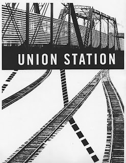
Union Station (Railroads):
This line study was from my projected angular line studies and the lines were really fuzzy so I vectorized it so it would be easier for me to visualize. I was really stumped on this poster for awhile, because I couldn't get the lines and the railroad tracks to look cohesive. It didn't seem like there was much to work with from the line study or the photo so my first thought was to bring in another element. I decided to use an image of the bridge that sits above the tracks as that other element and it helped to specify and represent the tracks of Union Station.
Union Station (Doors):
I tried a couple of compositions for this poster, but none really communicated Union Station so I brought in the doors to help. I was afraid that the doors would be to dominant, and they were after we discussed this poster during critique. The paring was weak and therefore the poster was weak.
Union Station (Bridge):
Out of all the posters I created, this poster took the longest and has the most layers. The poster looks pretty simple, but if you look at the non-photocopied version, there are a lot of little sheets of paper to hide certain elements and to add others. During critique, Jamie mentioned that I took too much away from both the line study and the photo so it didn't communicate well, which I agree with.
Power & Light:
This was the last poster I worked on and I had no idea what to do. Again, the pairing was weak and therefore the poster was. I just tried to put them together and hoped something serendipitous would happen, which isn't the best approach.
Business District:
The image was pretty tight so I brought in another image of the same building to give me something else to work with. During critique Jamie mentioned that I should of placed my text on an angle because there are so many happening. In fact, while I was creating this poster I tested out so many different text sizes in the various angles that exist, but it didn't work out so that's why I have it where it is. Maybe, I was doing something wrong so when I convert this digitally, I'll try again.


sick.
ReplyDeleteFor the last one, try the text NOT on an angle too - iterations for comparison. ALIGN the B and the T to some element in the photo above or below.
ReplyDelete