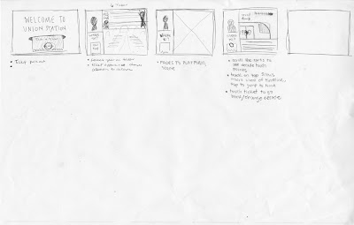
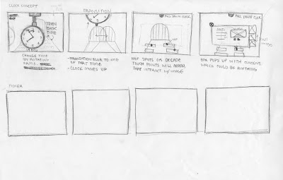
In developing our concepts for Union Station, Jessie Ren and I sought out to recreate the journey and nostalgia of riding the train in our first approach. The user would begin the experience by receiving a ticket at the ticket booth, then prompted to choose a decade while in the waiting hall. Lastly the user will be taken to the platform where the content of the decade will reside. The user will use the train as a scroll bar for various content. In addition, the gentleman at the ticket booth would act as a tour guide to help clarify directions and to change decades.
 |
| Direction 01 |
 |
| Direction 02 |
Revision of Direction 01:


No comments:
Post a Comment