Showing posts with label TYPOGRAPHY IV. Show all posts

3.11.2012

Experiments 4 & 5

So with our latest experiments, we were able to explore the digital realm of interactivity. Both Sam and I played with different types of interactive play. We were able to get people interested in what we were doing. We will package our experiments so that it will be projected (multiple projectors) in a room that allows a larger, freer range for people to participate in. We're very excited to be playing with processing, and venturing into the world of augmented reality using flash. As we work out the kinks in our "exhibit", we will also consider the sequence. Is there going to be a sequence or is it more about free play?


2.24.2012

Experiment 3

This experiment is our last analog exploration until we move into the digital phase. We used these analog experiments to determine how people play with language. Now it's about interaction, which we will explore in our next phase. This experiment deals with the whole idea of playing a game where one attempts to find a solution. Sam constructed cubes that had a different piece of a character from four different languages: Korean, Japanese, Chinese, and Russian. These pieces were then arranged in a whatever order the participant wanted or felt achieved a visual conclusion. We recorded the results through photographing the mid-process and the conclusory arrangement. We noticed throughout the experiment, the participants were trying to match the lines together to create a fluid form. This is an observation we considered to be the fact that we as human beings intrinsically search for order or structure. Thusly how can we further apply this or test this in the digital space?


2.17.2012

Experiment 2: Language Barrier?

Jessie and I got our thoughts together and re-evaluated what our goals were, and what questions we wanted to answer. It was a good time to collectively figure out the kind of experiments we wanted to conduct. After a brief discussion on how we felt as cultural minorities, we determined that our primary question at this point is: While languages looks very different, at the heart of it, are they very different? How can we get people to appreciate the beauty of form? Is this typographic form of varying languages arbitrary or did it stem from the same common ideas that we all have? Jessie and I built our experiments physically, working analog. We tested 3 ways. 1. We asked students to write a series of words that resembled the Chinese language based strictly from what they perceive it as, without outside reference. 2. As a follow-up to the first part of the experiment, we cut out these words in chinese and mixed up the strokes, asking students to rearrange the strokes as they thought the word should look. 3. We created a cube with multiple transparencies of different symbols and characters of several languages. By stacking them one behind another, we could simultaneously see the forms crossing over, a formal exploration on literally collaging language. This direction focuses primarily on the appreciation of form through play.


TEST 02:


TEST 03: 

looks like a smily face


2.14.2012

Experiment 2: Direction

This project has greatly evolved since day one yet we've always been concerned with the human dimension of it all. We're still focusing on the question, how can typography cross cultural boundaries, and how can experimental typography serve as a bridge to fill the gap that is the communication breakdown. Essentially, we're interested in how can we create new ways for people to communicate where they could not before.

Over the weekend Jessie and I considered different possibilities for the next experiment and how we could build off of the previous one. We're interested in interaction and the possibilities of he digital realm. It would be interesting to build some type of interactive object that uses basic programming inputs and outputs, but we've yet to figure out how this is relevant.

So for our second experiment, Chris suggested we move out of the digital realm and possibly work with physical wireframes because interaction isn't two-dimensional. During class I was thinking, what if we created some type of messaging device. What if we focus on communication between two people. What if person A can communicate through one channel and receive feedback through another, while person B communicates in the reverse. Is this then commentary on cross culture communication? Is the experiment then in how each party encodes and decodes a message? I believe this may be the direction we head down this week so until next time, happy experimenting.

2.06.2012

Testing the Waters

After doing our first experiments and research we realized it wasn't taking us anywhere so re-assessed what we were wanting to do and focused on a common denominator in communication. We realized emoticons are new developments in new media. They are a physical representation of human emotion and body language  in a new digital space. This idea helped to inspire our revised question, "how can typography cross cultural boundaries? How can experimental typography serve as a bridge to fill in the gap that is the communication breakdown."

Jessie and I developed two separate experiments to test the emoticon direction. My experiment focused on language and how emoticons with language effects meaning/feeling.


On the other hand, Jessie focused on the digital space, and how we can further explore the affordances of typography and emoticons in Processing. Through her experiments we hand a serendipitous moment. We found by accident how to associate key strokes with color. We then came up with this idea about how we can associate type with color and also communicate a feeling through a range of color. For instance white being more positive and black being negative.


2.03.2012

Experimental Type Direction


Typography is the physical manifestation of language and language is the method of human communication, either spoken or written, consisting of the use of words in a structured and conventional way. It is a system of communication used by a community or a country. 

But our question now is, what really is typography?

While doing research on images for the type wall, both Jessie and I realized how difficult it was to find typography from different language, which then prompted this question. Typography isn't necessarily a universal language. Because typography stems from language and every language has its own sets of rules that are specific to it, that also means that each culture's typography will differ from our western concept of typography. If everything we understand about typography is solely based on western language, what does it mean to be an international typographer, what does it mean to be a Chinese typographer, or a Indian typographer, or a Russian typographer.

We speculate a larger question, but at this point in the process we aren't able to fathom what that may be. However, in order to reach that point we've developed a series of experiments that we believe encompasses the overarching concepts of typography and language.

1. Form
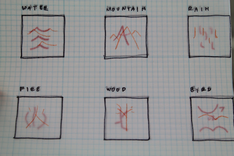
The first most common step in learning typography is studying form. As outsiders confronted with a new  languages, the first thing we can comprehend is the shape of the form. Just as we've done with the type wall, we need to see these physical manifestations of language next to each other. For instance, what would we discover if we were to arrange the typography based on geographical location. Depending on how we decide to organize our arrangement, maybe we'll discover different questions.

2. Rules
Each language has it's own rule base as does typography in order to legible and understood. For out second experiment we want to take western typographic rules and apply then to another culture and vice versa.

3. Context/Experimentation
Lastly, after understanding the form and learning the rules how can we then break both the form and the rules two combine the two cultures together. We are not trying to create a new language, we merely seek to widen our scope of typography.

Examples:
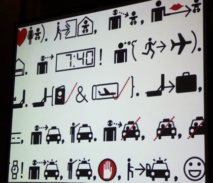
Many of the examples we've seen are mostly formal relationships between cultures, studies of language in general or attempts to make new languages.

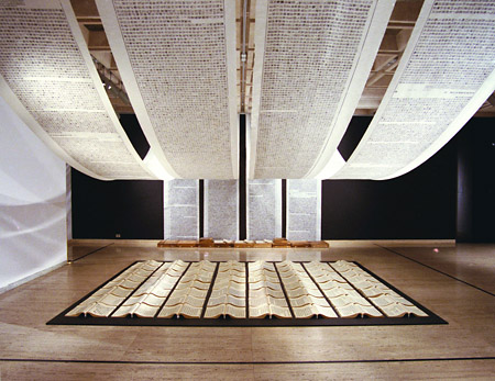
Xu Bing is an example an artist works in the medium of language He creates installations that question the idea of communicating meaning through language, demonstrating how both meanings and written words can be easily manipulated.