4.28.2011

Magazine: iPad Skin Iterations

In the translation process of my magazine to the iPad, I wanted to remain true to the rule set and design that I have already established in my printed magazine such as the solid positioning of my folio. Although the folio usually sat on the left and right side of my printed layout, I placed it at the bottom to also be used as menu element. Getting the body copy at a legible size while also working with the graphic elements to fit on the page was challenging for me. After my critique with Marty, it might be because I'm thinking of the real estate in the iPad as too much of a printed space rather than a infinite digital space.

a
b - menu bar slides in from the right once triangle is tapped
a
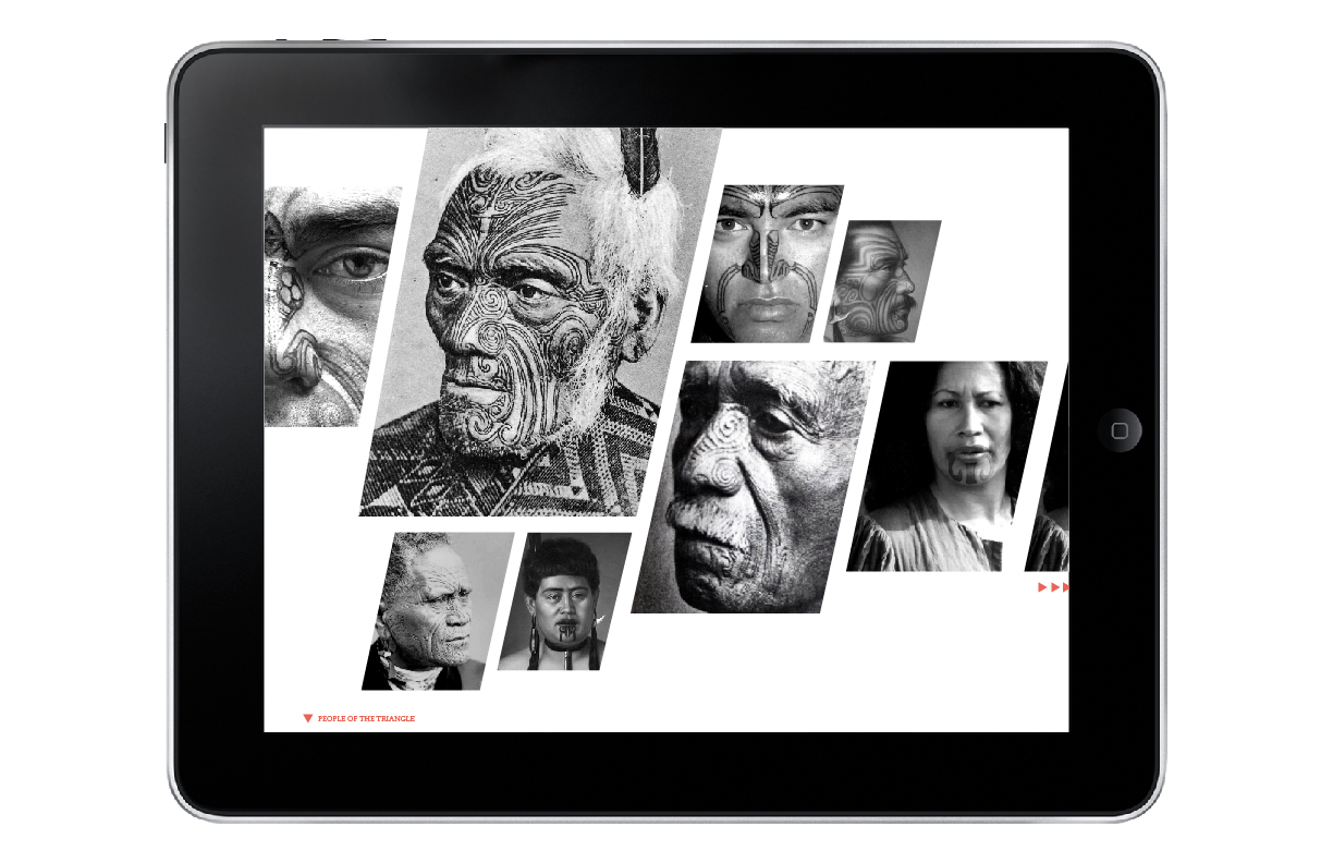
b - More information about the photo is provided once the image is tapped
embedded video plays once activated
a - tap the tattoo to reveal information

b - image & line info appear
a - tap the tattoo or icon to see connections
b - line element appears along with imagery

No comments:

Post a Comment