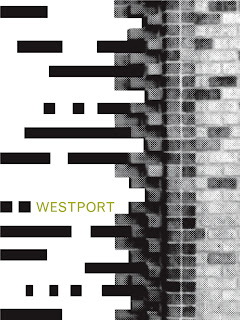
For my poster series I wanted to take a broader approach to Kansas City so I focused on multiple neighborhoods. I attempted to capture the overall notion or feel of a neighborhood as an individual, but also as a cohesive whole. Each neighborhood I studied shared this similar idea of movement and time in both a linear and cyclical projection. In each composition the formal and conceptual juxtaposition of image and line study helps to reinforce this idea. For instance, the combination of vectorized line studies with these photos of older objects in addition to their arrangement illustrates the shift through time from the old to new. In the Westport poster, I wanted the lines to flow into the bricks to illustrate the idea of revitalization. Westport itself is a historic neighborhood, and while time is linear the idea of rebuilding upon the old is cyclical.
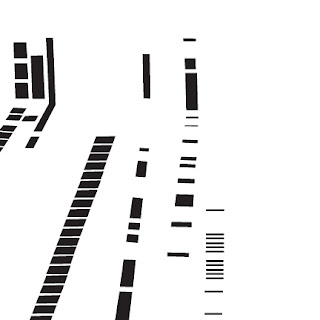
Like Westport, the Crossroads is also a historic neighborhood and the shift from the railroad tracks into the line study, which mimics the tracks, communicates a similar shift of old into the new. I wanted the organic tracks moving in various perspectives in space to represent the intersecting people, ideas and art that the Crossroads is known for.

In each composition, I tried to consider the negative space in order to help create a more dynamic composition. Formally, the juxtaposition of line study and image combine to create one object because they share similar lines and angles. Conceptually, the line study alludes to the pace of business and its constant up and down shifts. The arrangement of the upside down image also reinforces this idea.

All three of these posters have mostly sustained throughout the entire process with some compositional and color adjustments. However, the most risky and recent adjustment was the manipulation of the images into halftone, which I was determined to make work. The use of the halftone adds to the overall vintage feel of all the neighborhoods and Kansas City as a whole. The juxtaposition of the line study, typefaces and colors are what I feel helps to modernize these posters.


Final 6 Pairings:
1.

2.

3.

4.

5.

6.

Line Evolution:
Stage 1
 |
| Basic Line Study |
 |
| Complex Line Study |
Stage 3
 |
| Raw Manipulation - Projected on wall |
Stage 4
 |
| Vectored |
Stage 5
 |
| Final Edited |
Stage 6
 |
| Juxtaposition with photo |
Stage 7
 |
| Combination in poster |
No comments:
Post a Comment