Design Principles
Swarm (framing, layering, proximity, compound shape):
This composition was designed to create a first person perspective of the celebrity. In order to create the feel of being swarmed, I kept the frame tight and layering multiple paparazzi characters in a near eye-level perspective. The compound shape you see is a character that personifies the paparazzi. Although they appear to be different patterns and colors they show proximity because of their shape.
Type and Dots: It feels redundant to write about each specific type piece because I've already done so in a previous post so I'll write about the serendipity of type and dot composition.
I don't feel that this piece was serendipitous because the concept of swarm in the type composition was different from the dot composition.
Praise (scale, continuation, repetition, layers, compound shape):
In this composition, I wanted to show how celebrities are praised. I made the icon figure larger and into a compound shape to distinguish it from the others and to show what was being praised in comparison to the people. For imagery, I repeated different crowd scenes from different periods to show the repetition of past and and future of celebrity worship. The dots are layered from small to large to create depth, but also repetition. Because the crowd images are cut off, they can continue on outside the frame.
Type and Dots: This piece is somewhat serendipitous, but the positioning of the "prais" is difficult to read, but the way the "e" frames the icon is nice.
Impulsive (correspondence, alignment, scale, repetition, proximity and continuation):
Although this composition is simple, it employs many design principles. I wanted to portray the impulsive aspect of the paparazzi in getting their shots. I used scale to create this sense of moving from the background to foreground and correspondence through material and compound shape to associate the larger dot with the smaller ones. The line of dots show repetition and the larger dot breaks the pattern to also reinforce the idea of being impulsive. Because the line of dots are aligned near each other they show proximity and the viewer associate those dots as a unit. In addition, because the dots move on and off screen, they create a continuation.
Intrude (correspondence, repetition):
I wanted to show the idea of the paparazzi intruding in the lives of celebrities. I used a subtle scale to create a movement through a group of celebrities. This movement of one dot rather than three is reinforced by correspondence of the repetition of material and shape.
Ignore (alignment, correspondence, compound shape):
This composition is a bit more narrative. in attempt to show how celebrities often ignore the paparazzi. The alignment of this composition is important in the sequence how to read it and the correspondence of both compound shapes helps us to read the image.
Secretive (compound shape, positive and negative space):
The composition for secretive is an attempt to create a first person in the perspective of the paparazzi in capturing secret shots. At first glance, positive and negative space are being used to help reinforce how the paparazzi works.
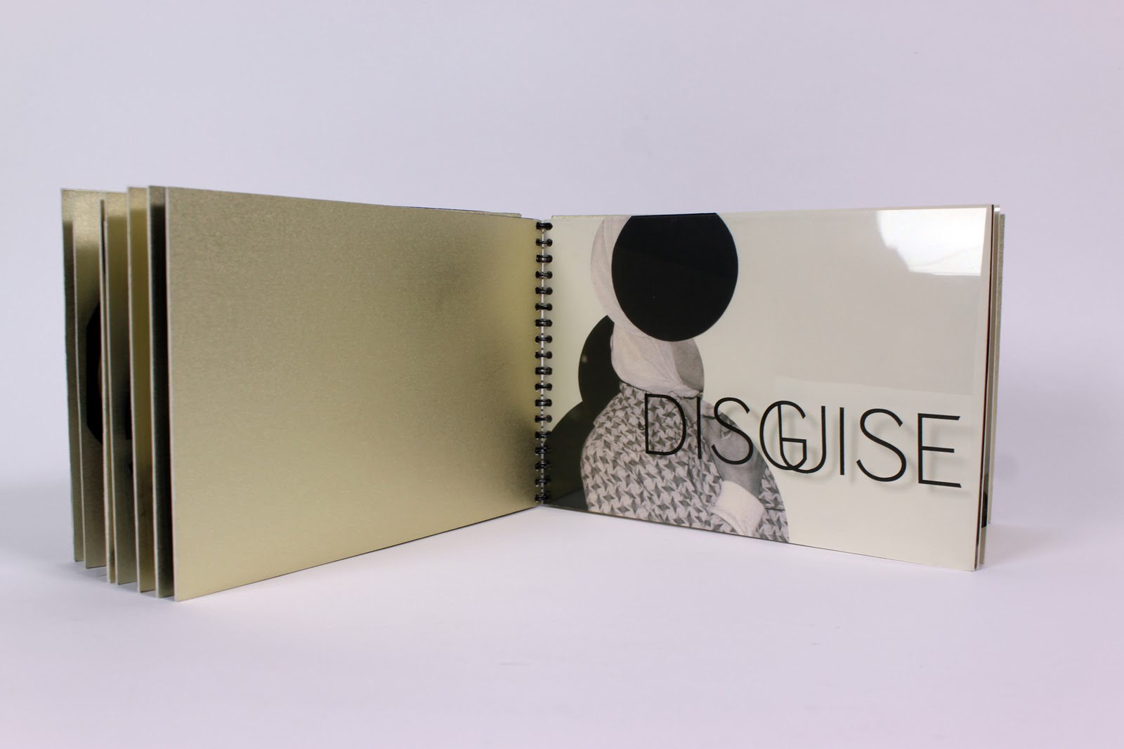
Disguise (compound shape, framing, scaling):
This composition is quite simple, because it only shows a large compound shape. The scale is larger in order to draw attention to the mask covering up the compound shape that has previously been clean.
Exaggerate (compound shape, layering):
The composition for exaggeration is also simple illustrating the icon compound shape. Layering is used to represent the idea of the paparazzi exaggerating the lives of celebrities.
Destroy (correspondence, repetition, proimxty):
This composition shows how the paparazzi can destroy the lives of celebrities. On this page, correspondence and proximity are being utilized. The paparazzi character appears as an outside force destroying the celebrities. Proximity allows the broken pieces to fall apart yet be seen as a unit because of the shape as well at the imagery being used.


Nice project documentation, especially the last photo showing the transparency.
ReplyDeleteInsert the book examples NEXT TO the explanations (as captions). It is difficult to see what you are talking about if the images are all down at the bottom.
ReplyDelete