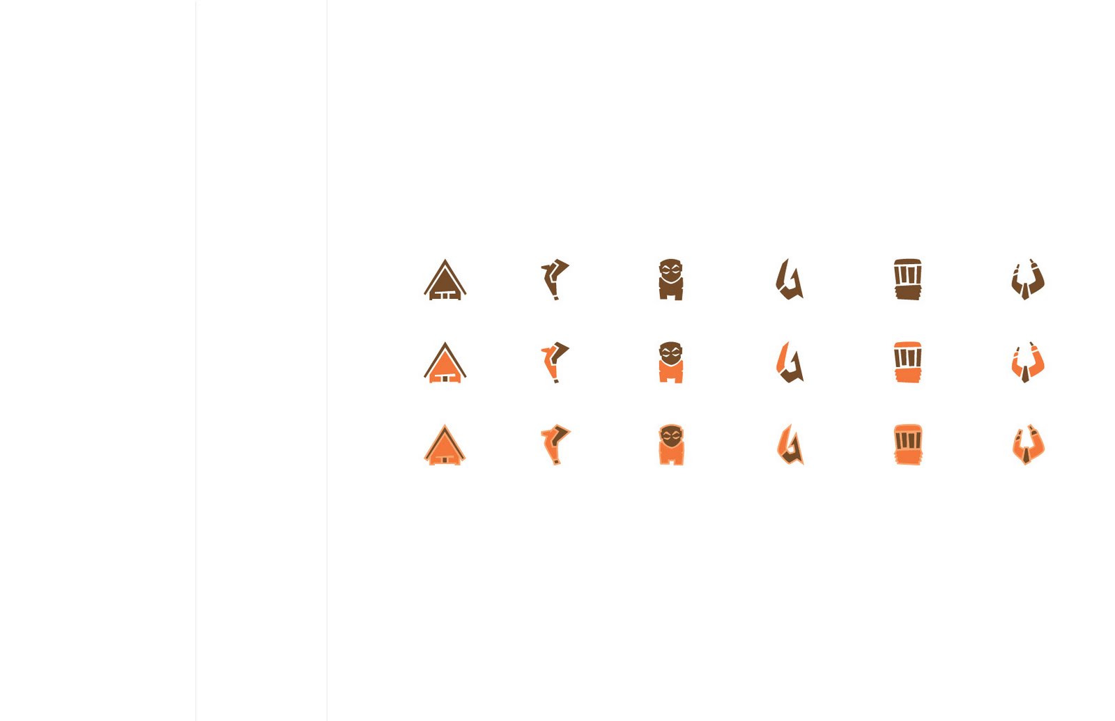
So the end finally comes for my time with the People of the Triangle and might I just say, it's been a long and exciting journey. For the Smithsonian exhibit, I felt it was the perfect opportunity to explore an area of Polynesia that I have yet to explore. For majority of the semester I've been using my projects as means of teaching others about the general culture, but for this project I wanted to make more of a statement. My exhibit focuses on how tourism, beginning with European colonialism, hurts the authenticity of the Polynesian culture. Formally I explored this concept through the juxtaposition between photograph to represent the authentic culture and my icon set to represent the tourist culture. The knocked out figure in the photograph that interacts with the icon illustrates the fading of the culture.
Key Process Moments:
Here are some of the preliminary steps that led me to my final direction. For instance my decision to further explore the tourist aspect of Polynesia with the knockout usage was inspired by the first image below from Round I. The manner in which the photography interacts with the icon was inspired by the third image below.
The title of the exhibit was one areas that I was constantly struggling with throughout the project from the actual rendering to it's application. This was an important moment for me because it reminded me of the typography can allude to the concept formally and even work as a means of branding.
These last two process moments helped shape my final visual decisions. Initially I had planned to move forwards with the illustration version because it was more formally resolved and had more variety the photographic version, but later in my process I was not pleased with them. This step taught me how to stop, look back in my process to find decisions that worked and didn't. I realized that the banding and patterning were the most successful part of the illustrative version while the striking aspect of the photography in the other version was successful. So I decided to combine those two elements to create a more powerful combination.
Final Proposal:
Showing posts with label V-COMM II. Show all posts
5.05.2011
4.29.2011
Identity System: Smithsonian Exhibit Round II
This round was very much about refining and pushing our identity systems towards a solid direction. As I mentioned previously, I wanted to further explore designing the actual layout of the exhibit and possible way finding materials.
Identity System: Smithsonian Exhibit Round I
I'm really enjoying this project. There are so many possibilities, but so little time. As a refresher, my exhibit focuses on how the European influence and the introduction of tourism effects the authenticity of the Polynesian culture. For this round I wanted to push my work a bit further then the requirements, and while there were a lot of interesting products I could possibly design, majority of it was counter productive to my concept. So instead, I introduced the iPhone app and some of the visual displays of the exhibition layout, which I plan to further explore. In my previous critique with Jamie, we talked about how the bag and t-shirt can act differently from the promotional material of the exhibit so I attempted to use the bag to reinforce my concept. One side of the bag would have a cut out of the icon to represent the tourist culture and the other side would have an image to represent the authentic culture which would be printed on transparency. The two sides can be seen from both sides and create a dialog between each other.
Subscribe to:
Posts (Atom)