
Showing posts with label TYPOGRAPHY I. Show all posts
Showing posts with label TYPOGRAPHY I. Show all posts
12.06.2010
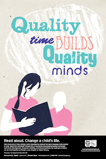
T1: Final Reach Out and Read Poster
For my poster I wanted to focus on the relationship between child and parent and how the spent by reading can not only build memories but also be beneficial to a child's development. I constructed the poster by hand, the figures made with cut paper and the headline written by hand then both converted and arranged digitally.

11.28.2010
T1: Reach Out And Read - Round IV
Taking a new direction with these posters was a good idea. Marty suggested that I dropped the headline of "Fuel for the Future" and start thinking warm and fuzzy. In order to make my poster typographically dominant I made the parent and child figure smaller in comparison to the type so that the imagery is more of a supporting factor to the type. For my headline I decided to change it to "Quality Time Builds Quality Minds" to emphasize the idea of how reading with your child not only allows the parent and child to spend time together, but it is also beneficial to the child's intelligence. I hand wrote all of the type to create a more childlike and quirky feel using various writing utensils such as crayons, markers, and pencils for their particular quality before I vectorized them. Overall I'm pleased with this new direction because I think there is more potential and more personal.


11.19.2010
T1: Reach Out And Read - Round III
For round three (I think this is round three) we took our one concept from last critique and created 5 poster iterations. This time around I tried to bring in a parent figure so that it communicated "parent reading to child." When I began I worked all digitally, which is what I didn't want to do for this project so I attempted to bring in a more analog aspect. The digital posters were just so flat and looked way too cheesy computer vectory. Anyways, for one poster I tried to use cut out construction paper and juxtapose digital type. For my last poster, I created an illustration to create more of a personality than the blank faced people. I really like how the illustration came out, but it just doesn't work as well for my purposes. However, I am glad that I've been able to explore my illustrative abilities these past rounds.


11.15.2010
T1: Reach Out And Read - Round II
For this round of the project we took our three concept ideas and digitalized them. During critique, Julie and Kelsey who are juniors helped us choose a direction to move forward with.
Fuel for the Future:
For the poster below, I wanted to focus on the idea of books being the fuel for a child's future. The biggest issue that came up during critique was communication. Overall, the poster doesn't convey the concept, because it lacks context to books and a parent figure. To help communicate the idea better, Julie mentioned moving the letters from the body to the head and maybe making the "FUEL" title the same pinkish color as the letters.
Later, after critique, I was trying to figure out how to give more context to books without making the composition cheesy or lame. Marty suggested that I think along the line of adding some reference to books in the background like a bookshelf. So, first, I need to resolve the issues mentioned during critique and then I really need to push the iterations in very different directions, but maintain the concept.


For a Brighter Future:
I wanted to start off by saying that I enjoyed making these happy people and I'm glad I got good feedback on them. Anyways, for this poster I was trying to speak to both the parent and the community, because not all children are financially equal. It also touches on the saying, "it takes a village to raise a child," because it's not just parents that can get involved with this cause. The poster isn't really typographically dominant and it moves away from the direction of the contest.

Fuel for the Future:
For the poster below, I wanted to focus on the idea of books being the fuel for a child's future. The biggest issue that came up during critique was communication. Overall, the poster doesn't convey the concept, because it lacks context to books and a parent figure. To help communicate the idea better, Julie mentioned moving the letters from the body to the head and maybe making the "FUEL" title the same pinkish color as the letters.
Later, after critique, I was trying to figure out how to give more context to books without making the composition cheesy or lame. Marty suggested that I think along the line of adding some reference to books in the background like a bookshelf. So, first, I need to resolve the issues mentioned during critique and then I really need to push the iterations in very different directions, but maintain the concept.
Planning for Success:
For this poster I wanted to focus on how reading with children can influence a child's future through a mind map. Again, my issue was communication along with the composition being too busy.
For a Brighter Future:
I wanted to start off by saying that I enjoyed making these happy people and I'm glad I got good feedback on them. Anyways, for this poster I was trying to speak to both the parent and the community, because not all children are financially equal. It also touches on the saying, "it takes a village to raise a child," because it's not just parents that can get involved with this cause. The poster isn't really typographically dominant and it moves away from the direction of the contest.
11.08.2010
T1: Speaking Periodically - Final Artifact
Monogram:

Web Layout:

Reflection:
I don't know why I had such a difficult time cutting mat board and mounting this time around and I would elaborate, but it's a long story. Anyways, I really did enjoyed the various stages of this assignment. Firstly, because the monogram portion of the assignment really helped in a logo design I was working on for my mini-internship and secondly, because I enjoyed arranging the elements in a space while maintaining legibility and creating a dynamic composition. It was interesting to see how moving one element can drastically change the relation of other elements within the space. Trying to find a balance is the most difficult part, but also the most rewarding.
11.03.2010
T1: Webpage Layouts - Round II
For this round of the project we needed to pick one layout out of the five to refine. I had a couple of possibilities after critiquing with Marty so I thought I should refine all of them and figure out which is the strongest. In the image below I had my title right aligned, which really conflicted with the rag of the body type. So, I left aligned the title and lowered the font size so it's width would be even with the body. This composition is a bit more successful than some of the others.

I originally had the text of this image cut off so it wasn't legible, and it's important part of my image so I moved it over. The space was tight so I elongated the page to make room for my properties.

This may be the first time I've made my image smaller than my monogram, and I think it's maybe more successful than some of the other refinements. My monogram was cut off from the previous round so I moved it over. I also added a properties sub-head to make the column it's own because it was nearly aligned with the second paragraph of the body text.

I tried aligning my monogram is different positions and the image below was probably the best out of the other positions, yet overall I don't think this layout is very successful. It was worth a try.

I originally had the text of this image cut off so it wasn't legible, and it's important part of my image so I moved it over. The space was tight so I elongated the page to make room for my properties.
This may be the first time I've made my image smaller than my monogram, and I think it's maybe more successful than some of the other refinements. My monogram was cut off from the previous round so I moved it over. I also added a properties sub-head to make the column it's own because it was nearly aligned with the second paragraph of the body text.
I tried aligning my monogram is different positions and the image below was probably the best out of the other positions, yet overall I don't think this layout is very successful. It was worth a try.
T1: Leading
For this part of the assignment we experimented with various type sizes and leading. I wasn't exactly sure what I needed to watch out for when I made these, but after critique everything made more sense. Because each typeface is different, the relationship between the point size and leading will vary, but it takes a careful eye to see when it's just right. Like any beginner I make mistakes, but my mistakes help me to understand when and why things are and aren't working. For instance, if you use a small font size don't make your leading too big because the negative space becomes more apparent than the positive space.

Final Leading: Trade Gothic LT Std, Regular, 10/14
I chose this particular typeface and weight because it has a nonchalant feel and contrasted nicely with the boldness of my monogram.

Final Leading: Trade Gothic LT Std, Regular, 10/14
I chose this particular typeface and weight because it has a nonchalant feel and contrasted nicely with the boldness of my monogram.
11.02.2010
Web + Grid = "Ooo."
Collaborative blog post with Kyndra
In relation to the current stage of our web page layout designs, Dan Auer documents his use of grids on web pages similar to the format we are using. His design included navigations, which in the future will be more applicable to our study in web design. Auer uses a larger grid format that allows for a cleaner and more simplistic design. While relating to our process, we lack a formal and simplistic grid system like Auer. Instead, we're working in allowance for freedom in space, not giving us the consistency and unity shown below.


In relation to the current stage of our web page layout designs, Dan Auer documents his use of grids on web pages similar to the format we are using. His design included navigations, which in the future will be more applicable to our study in web design. Auer uses a larger grid format that allows for a cleaner and more simplistic design. While relating to our process, we lack a formal and simplistic grid system like Auer. Instead, we're working in allowance for freedom in space, not giving us the consistency and unity shown below.
FYI: Collaborative writing/blogging is difficult.
Photos from http://www.behance.net/danauer
11.01.2010


10.31.2010
T1: Monogram Iteration Round III
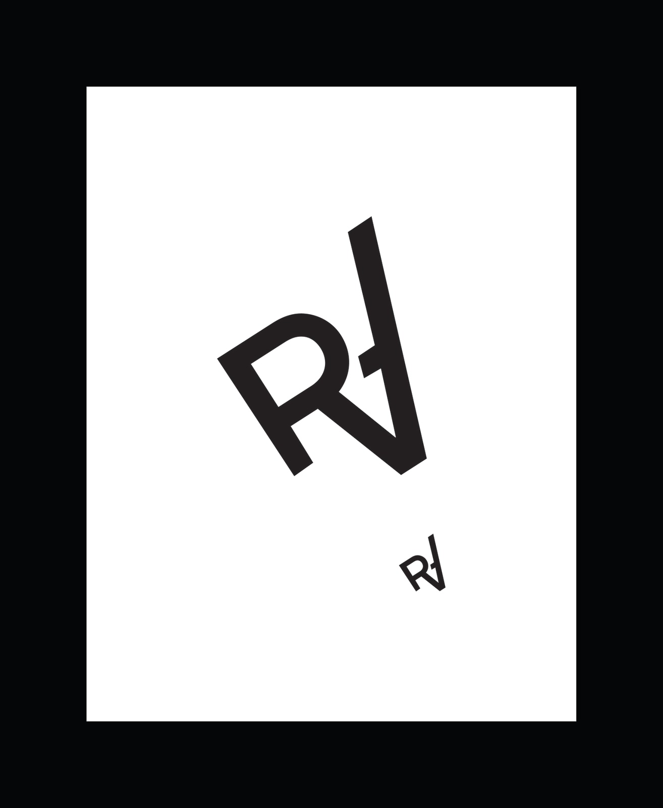
From round two we picked one monogram to refine and we didn't have a set amount of refinements to make. With more freedom comes more responsibility, but of course the final product must still be great. The number of refinements necessary really varied from person to person, because some monograms needed more work than others. For my monogram I needed to make the stem of the "A" a bit shorter and make the "R" more visible. Erika suggested to create a break between the "A" and the "R" so in my iterations I tried to put the breaks at different points. I also positioned the monogram at different angles, but I realized that it worked best on a diagonal rather than straight because it makes it more dynamic.


Final Monogram:

Final Monogram:

T1: Layouts - Round II & Final Layout
For this round we picked our two strongest layouts to refine, but I somehow ended up with three to play around with. For the layout below, I decreased the font size of my properties because they were too large and cluttered. I also got rid of the graphic element that mirrored the monogram so the layout would be less symmetrical and static.
From the previous layout I've greatly decreased the font size of the properties so it wouldn't overpower the text. Then I left aligned everything because before I had a mixture of left and right aligned text which made it inconsistent.
For my third layout I got rid of the row of properties that existed on the right side and aligned my title with an element of the monogram. I had a lot of issues trying to place the image below the text so it would lead your eye off the page, but instead both iterations just look disconnected from the first page.
Final Layout:
Since I had a lot of issues with placing the image, Marty suggested that I flip it and make it larger. The image tends to creates awkward spaces due to the "L" shape of the image so after flipping it I moved the second paragraph into that awkward space and it really help solved the problem. Now I feel that there is a nice balance between the title and the line of little people.


 |
| layout 01 |

From the previous layout I've greatly decreased the font size of the properties so it wouldn't overpower the text. Then I left aligned everything because before I had a mixture of left and right aligned text which made it inconsistent.
 |
| layout 02 |
For my third layout I got rid of the row of properties that existed on the right side and aligned my title with an element of the monogram. I had a lot of issues trying to place the image below the text so it would lead your eye off the page, but instead both iterations just look disconnected from the first page.
 |
| layout 03 - A |

 |
| Layout 03 - B |

Final Layout:
Since I had a lot of issues with placing the image, Marty suggested that I flip it and make it larger. The image tends to creates awkward spaces due to the "L" shape of the image so after flipping it I moved the second paragraph into that awkward space and it really help solved the problem. Now I feel that there is a nice balance between the title and the line of little people.

10.25.2010
T1: Find & Share - Issue 45
FLOZ is a French trio of graphic designers founded in 2009 by Kathia Saul, Rémi Andron and Thiébaud Chotin who graduated from the Ecole de Condé and from Les Gobelins. The three friends teamed up as a cooperative of creative talents, aiming to provide their clients with contemporary communication and visibility through editing, web design and illustration. Their work is often geometrical, pure and high in color. In their collaboration with the French fashion and culture magazine, WAD, the trio used angled grids to create a dynamic spread that varies from page to page.
I don't know much about page layouts, but it is logical for certain types of magazines to use particular grid patterns in decisive ways. Because WAD's target audience is geared towards a younger demographic that associates with various subcultures, the inconsistencies in their spreads are relevant. I might be over analyzing this idea, but subcultures in general act in rebellion against the dominant culture. The spreads only reinforce the idea of non-conformity and anti-regularity. In relationship to our current assignment, how could we have organized our spreads differently to help reinforce the elements we're representing. I'm sure some of were already thinking this way, and I commend you guys for thinking critically.
Some of these grids are difficult to classify because I'm not sure whether to count the areas created by the angle as a column or not.
3 Column Grids:


2 Column Grid:

This is a question mark:


Either 4 or 5 Grid:

Images from http://www.behance.net/gallery/WAD-Magazine-issue-45/560775
I don't know much about page layouts, but it is logical for certain types of magazines to use particular grid patterns in decisive ways. Because WAD's target audience is geared towards a younger demographic that associates with various subcultures, the inconsistencies in their spreads are relevant. I might be over analyzing this idea, but subcultures in general act in rebellion against the dominant culture. The spreads only reinforce the idea of non-conformity and anti-regularity. In relationship to our current assignment, how could we have organized our spreads differently to help reinforce the elements we're representing. I'm sure some of were already thinking this way, and I commend you guys for thinking critically.
Some of these grids are difficult to classify because I'm not sure whether to count the areas created by the angle as a column or not.
3 Column Grids:


2 Column Grid:

This is a question mark:


Either 4 or 5 Grid:

Images from http://www.behance.net/gallery/WAD-Magazine-issue-45/560775
10.15.2010
T1: Monogram Iteration Rounds II
The monogram in red below is my chosen symbol to further explore. For my three concepts I focused on radiation/radioactivity, mutation, and breakage. I feel that my radiation and breakage compositions are the stronger formally and in relation to the element itself. My biggest issue with mutation is that it doesn't represent the element as well as my other two concepts. The concept worked best for the letters to be curved so I used a combination of upper and lowercase or all lowercase while I was creating the symbols. However, while curves worked best for the concept, it moved away from relating to the element. The angular forms of the radiation and breakage forms are more emotionless than the curves of the mutation iterations, which makes them more successful.


10.11.2010
T1: Monogram Iterations Round I
Below are images of my research for Radium. In general, radium is luminescent, extremely radioactive, and can cause major health issues. I had a lot of trouble understanding how to represent the characteristics of the element in my symbols.


Sketches: (Sorry for forgetting to put them up)


Subscribe to:
Posts (Atom)